How many colors you need for packaging printing
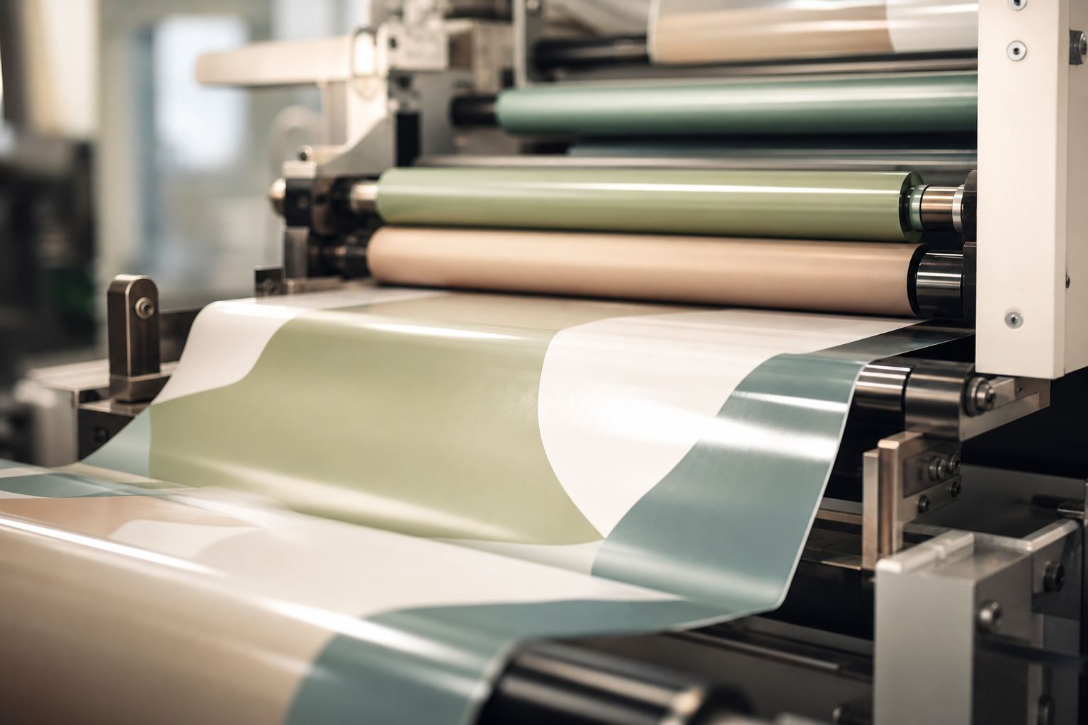
How many colors should go into a layout? That single number shapes both the look of the package and its price. Some brands get by with one color; others want rich photos plus a brand Pantone and a metallic on top. Let's work out how many colors your design actually needs, and where you really shouldn't overpay.
Matrix Pack prints from 1 to 9 colors. Photos usually need just four CMYK colors; an exact brand shade calls for a spot Pantone; and transparent film gets a white underprint first. Every extra color means a separate print station, so the smaller your palette, the cheaper the prep.
What the number of colors means in printing
In packaging printing, a color isn't a pixel on a screen; it's a separate ink laid down by its own press station. So when someone says "printing in 5 colors", they mean the layout is split into five inks that overlay one after another to build the final image.
There are two ways to reproduce color: process (CMYK) and spot (Pantone). More often than not they work together, with the base photo printed in CMYK while a logo or background gets its own exact color.
CMYK or Pantone spot colors
CMYK is a set of four base inks: Cyan, Magenta, Yellow and Key (black). Mixed as halftone dots, they reproduce almost any shade and full photographic images, which makes CMYK the go-to standard for complex artwork.
A spot color (Pantone), by contrast, is pre-mixed to a specific shade. It prints as a solid layer, precise and identical from run to run. The difference is easiest to see side by side:
| CMYK (process) | Photos, gradients, complex illustrations. The shade can drift a little from run to run |
| Pantone (spot) | Brand colors and solid fills: an exact, repeatable shade |
| CMYK plus Pantone | Photos plus a logo or background in a guaranteed exact color |
When spot colors are a must
- Brand color. When a logo has a strict shade (that one specific green, say), it's safer as a spot color, since CMYK can easily drift off.
- Metallics. Gold, silver and other metallic effects simply can't be built from four process inks; they need a separate metallic ink.
- White underprint. On transparent or metallized film, white goes down first, otherwise the colors on top look washed out and let the background show through.
- Rich solid fills. A large single-tone background looks more even and deeper as a spot color than as a CMYK screen.
How the color count affects cost
Behind every color sits a separate print station: it needs a plate (in flexo), a cylinder (in rotogravure) or a plate (in offset), plus its own setup. A few things follow from that:
- The fewer colors, the cheaper the preparation (prepress and plates) and the faster the run starts.
- On large runs the prep cost spreads across thousands of pouches, so the per-unit difference all but disappears.
- On small runs, though, every extra color noticeably hits the budget.
A simple tip: don't add spot colors "just in case". If your photo is in CMYK and there's no brand solid fill, four inks are perfectly enough.
How color count depends on technology
We print in three ways, and each handles color differently:
| Rotogravure | Unbeatable on long runs: stable rich color and wide cylinders up to 1400 mm |
| Flexo | Flexible on medium runs, easily mixes CMYK and spot colors |
| Offset | Fine detail for complex images and small text |
Whatever the technology, we take layouts from 1 to 9 colors, print on PET, PE, PP, AL and kraft, and develop the artwork itself for free.
Color proof on the material
The same color reads differently on gloss, matte film, kraft or a metallized base. That's why, before the run, we sign off the shade on the very material your packaging will be made from. You see the real result instead of a rough digital proof, with no nasty surprises after printing.
Want a quote for your artwork?
We will advise the optimal number of colors and technology. The quote and artwork development are free.