How to prepare artwork for packaging printing
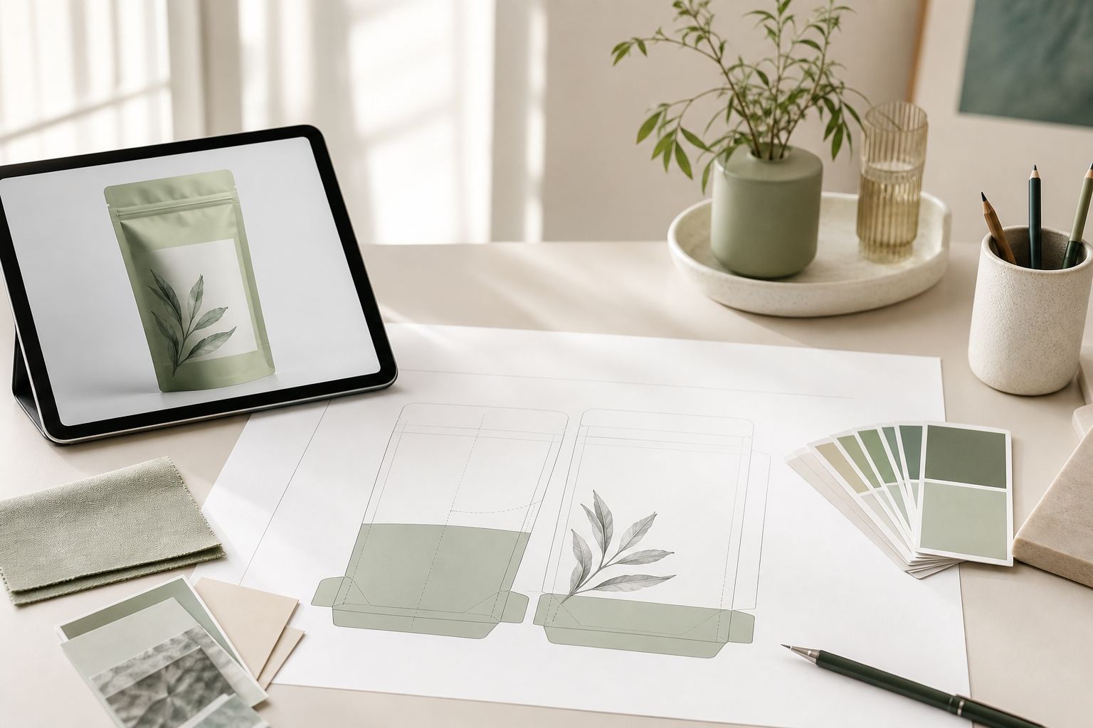
Well-prepared artwork is half the battle in printing. File format, color mode and bleeds decide whether the finished package looks the way it did on the designer's screen. Here's how to submit artwork so the print run goes right the first time.
Submit vector artwork (AI, CDR or PDF), colors in CMYK or Pantone, raster elements at 300 dpi or higher. Add bleeds of 3 to 5 mm, keep text inside the safe zone, convert fonts to curves and include the dieline on a separate layer. Matrix Pack develops and adapts artwork for free.
Which file formats we accept
There's one core requirement for packaging artwork: it has to be vector. Vector graphics scale without any loss of quality, so logos, wording and shaped elements stay crisp at any pouch size.
- AI (Adobe Illustrator), CDR (CorelDRAW) or PDF with vector objects: the ideal options for printing.
- EPS also works, provided all elements are saved as vector.
- Raster formats (JPG, PNG, TIFF) are accepted only for photographs inside the layout, and only at high resolution.
The difference between vector and raster is simple. Vector is built from mathematically described curves that don't fall apart when enlarged, while raster is a grid of pixels that breaks into visible squares on a large format. That's why logos and text should always be vector.
Color: CMYK or Pantone
A screen shows colors in RGB, but printing works in CMYK. Submit artwork in RGB and the colors will shift during separation: bright blues and saturated greens often go dull. So convert to CMYK back at the design stage, and you'll see the real picture from the start.
When you need an exact brand color, that's where Pantone (spot colors) comes in. Each one is mixed as a separate ink and holds steady from batch to batch, which is critical for brands whose logo shade must never vary. We print with rotogravure, offset and flexo, from 1 to 9 colors in a layout.
Resolution, bleeds and safe zones
Here are the three technical parameters that trip up inexperienced designers most often:
- Resolution. Every raster image must be at least 300 dpi at the real print size. A picture pulled from a website (72 dpi) will look blurry on the package.
- Bleed. This is background extended 3 to 5 mm past the cut line. Without bleed, thin white edges appear after trimming.
- Safe zone. An inset from the edge (usually 3 to 5 mm) where you must not place important text, the logo or the barcode, so they are not cut off.
Dieline, fonts and barcodes
The dieline marks the cut and crease line of the pouch. Keep it on a separate layer or on a dedicated spot color (named Cutline, for instance) so it doesn't end up in the print. We'll prepare or check the dieline for the format you need: doypack, flat pouch, pouch with a euro slot.
Fonts to curves. Always convert all text to curves (Create Outlines). Otherwise, if our computer does not have your font, the system will substitute another and the wording will shift.
Barcodes. Add the barcode as vector, with enough contrast (a dark code on a light background) and white quiet zones at the edges. Do not scale the barcode below 80% of the nominal size, or a scanner may fail to read it.
Artwork requirements checklist
| File format | AI, CDR or vector PDF (EPS if needed) |
| Color mode | CMYK or Pantone for brand colors |
| Raster resolution | From 300 dpi at real size |
| Bleed | 3 to 5 mm past the cut line |
| Safe zone | 3 to 5 mm inset from the edge |
| Fonts | Converted to curves (Create Outlines) |
| Dieline | Separate layer or spot color |
| Number of colors | From 1 to 9 in a layout |
What Matrix Pack does for free
Clients do not always have artwork that follows every rule, and that is fine. We take on the technical preparation:
- Artwork development from scratch or adaptation of your design to the dieline.
- Color separation and prepress file preparation.
- Checking bleeds, safe zones, resolution and barcodes.
- A digital proof and, if needed, color approval on the material itself before the run.
These services are included in the order price. You send what you have (a logo, an idea, examples), and we bring the file to print readiness.
Common artwork mistakes
- Artwork in RGB instead of CMYK, so colors go dull after printing.
- No bleeds, which leaves white edges after trimming.
- Text or barcode right against the edge, inside the cut zone.
- Fonts not converted to curves.
- Photos from the internet at low resolution.
- No separate layer with the dieline.
Need help with your artwork?
We will check your file, prepare the color separation and show a proof. Artwork development is free.